
TRIPADVISOR
PDP Optimization
Overview
I led a PDP optimization initiative ahead of a major marketing campaign driving traffic to TripAdvisor’s “Things to Do” PDP. The existing experience made it difficult for travelers to quickly understand what was included, key highlights, and overall value, which led to hesitation and drop-off. My main goal was to modernize the PDP and restructure its information architecture to improve clarity and increase conversion.
Role: Lead Product Designer
Company: TripAdvisor
Timeline: 3 Months
Impact
Desktop conversion increased by 8.72%
Mobile conversion increased by 9.36%
Established a scalable PDP framework adopted across Restaurants and Hotels PDP.
Problem
Travelers reached the PDP with high intent but hesitated to book due to unclear value and overwhelming content. Key decision-making signals were difficult to find, reducing confidence at the point of conversion.
Key issues:
Decision hesitation was high, with 42% of travelers revisiting the PDP an average of 3 times before booking
Text-heavy content created cognitive overload and made the page difficult to scan
The absence of authentic traveler imagery reduced trust and led to hesitation, as users were shown staged operator photos
Users showed low engagement, often skipping content and dropping off
INSIGHTS
Understanding how travelers evaluate experiences revealed a strong preference for speed, clarity, and visual proof over dense copy.
Users prefer scanning over reading
Travelers prefer quick, digestible content and struggle with long-form text, especially on mobileVisual proof drives confidence
Authentic traveler photos are more persuasive than staged imagery and play a critical role in building trustProgressive disclosure reduces friction
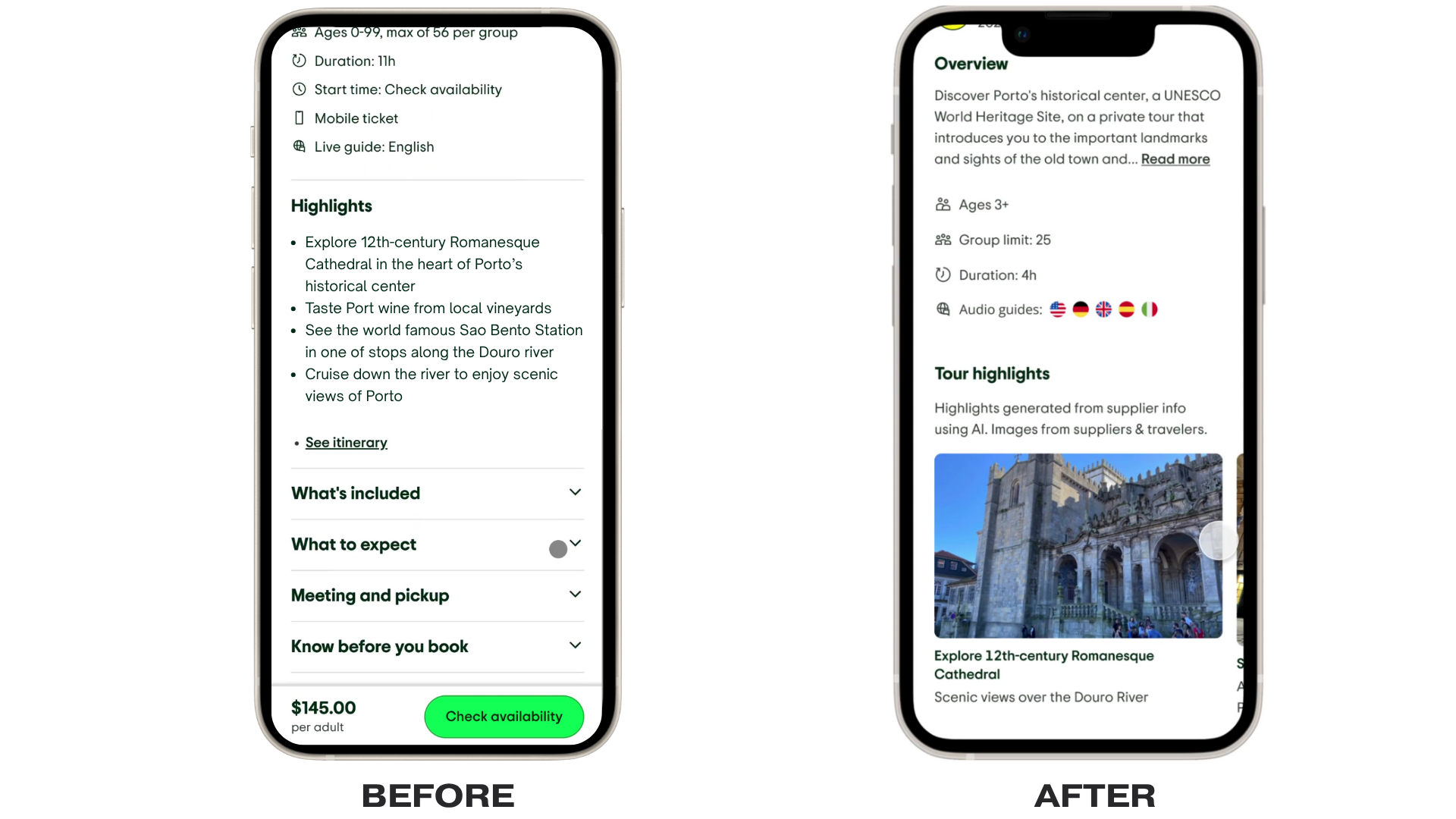
Condensing information on the PDP and allowing users to access details through modals (desktop and mobile) supports faster decision-making without overwhelming the pageVisualizing key information increases engagement
Converting tour highlights into imagery using machine-learning creates more engaging, scannable content and reduces reliance on text-heavy descriptions
Design Decisions
Grounded in behavioral data and funnel analysis, I focused on reducing friction at key decision-making moments while ensuring the experience could scale across TripAdvisor’s platform with a systems-thinking mindset.
Structured content for scannability
Reorganized inclusions and tour highlights into digestible sections, replacing long-form text with clear, scannable groupingsElevated visual proof with UGC
Introduced authentic traveler imagery into tour highlights and the itinerary to provide a real-world preview and increase trust over staged operator contentApplied progressive disclosure
Used overlays and modals across desktop and mobile to surface detailed information without overwhelming the primary booking flow
CROSS-PLATFORM SCALABILITY
The feature was designed with scalability in mind, leveraging reusable components and design system standards to enable consistent adoption across the platform. This approach allowed the experience to extend beyond tours into Restaurants and Hotels, supporting different content models while maintaining a unified user experience.
Final EXPERIENCE
The redesigned PDP improves clarity and decision-making by surfacing key information and authentic visuals at critical moments. A structured hierarchy supports rapid evaluation, while on-demand details provide depth without disrupting the flow, resulting in a more intuitive and confidence-driven booking experience.